Urban Eggs

UX DESIGN
Urban Eggs
Getting Fresh Eggs at Doorsteps
OVERVIEW
Urban Eggs is a mobile app that allows the residents of San Francisco to buy fresh eggs from the urban farmers (residents who raise chickens).
PROJECT TYPE
Class Project (Individual)
MY ROLE
UX Designer
SKILLS
Persona
Journey Map
User Flow
Prototyping
Usability Testing
TOOLS
Invison, Miro, Marvel, Sketch
DATE
10 Weeks
THE PROBLEM
In San Francisco, there’s a rising demand of farm fresh eggs from consumers, but driving frequently to a farm is impractical; at the same time, many residents (the urban farmers) are raising chickens producing an abundance of eggs in their backyard, but unconsumed eggs are often wasted.
THE SOLUTION
A mobile app that helps consumers to buy fresh eggs from the urban farmers in San Francisco.
THE APPROACH

RESEARCH
Proto-Persona – At the beginning of the project, I sketched out a proto-persona based on an imagined target audience.
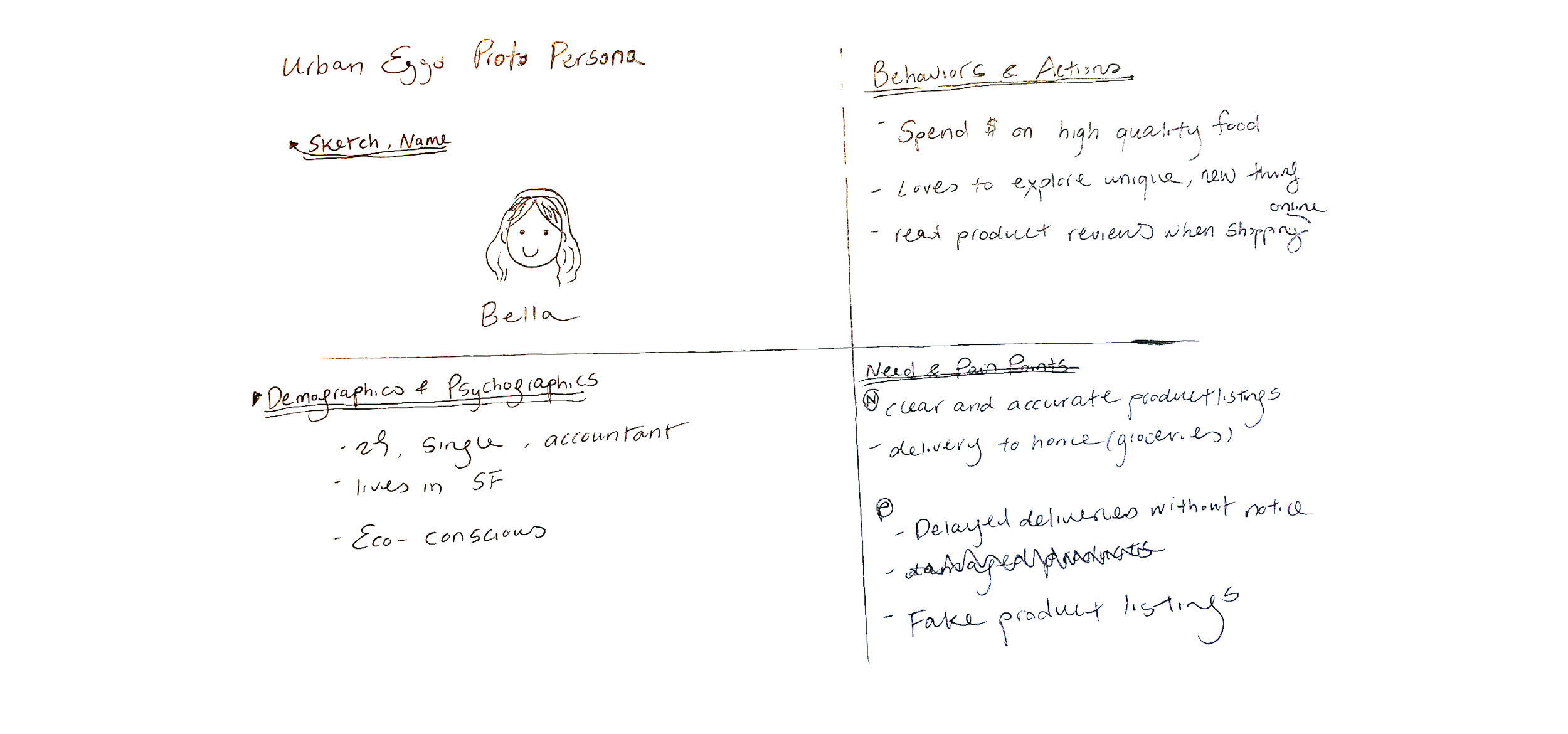
Interviews- I interviewed 3 participants and asked them about how do they usually shop for eggs and their online grocery shopping experiences in general. I found that:
3 out of 3 participants are willing to pay more for fresh, “unique-looking” eggs
3 out of 3 participants said that product photos and reviews affect their purchasing decisions
2 out of 3 participants prefer choosing a delivery time before browsing the products when shopping online for groceries.
Persona- Based on the interviews, I came up with the following persona:

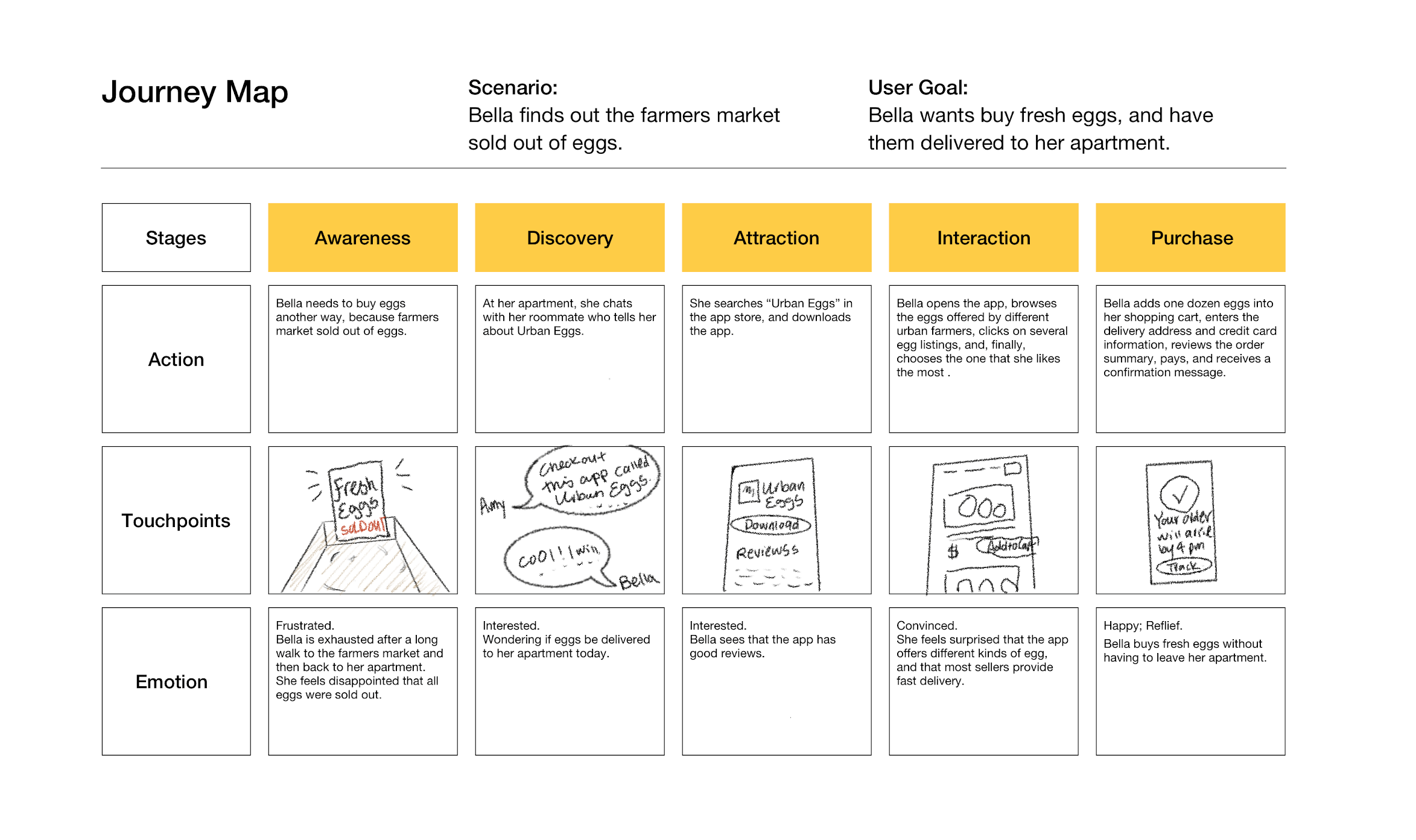
Journey Map – I created the journey map to visualize an ideal journey of the new user using the app to order eggs for delivery.
Story Mapping – I teamed up with two classmates who were working on the same design prompt. We used the persona and the user story to guide us to identify the major user activities and user tasks for ordering eggs.
Persona: Bella “the Browser”
User story: “ I’m a new user, I want to buy fresh eggs that can be delivered to my apartment, so that I don’t have to go to the store again.
We came up with the following story map:
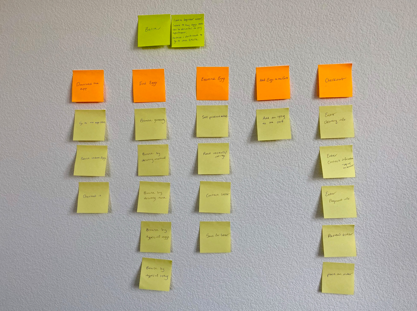
User Activities (orange sticky notes) and user tasks ( yellow sticky notes)
User Flowchart – I sketched out the flowchart to illustrate the hero path of the user ordering eggs for delivery.

Initial sketch
DESIGN
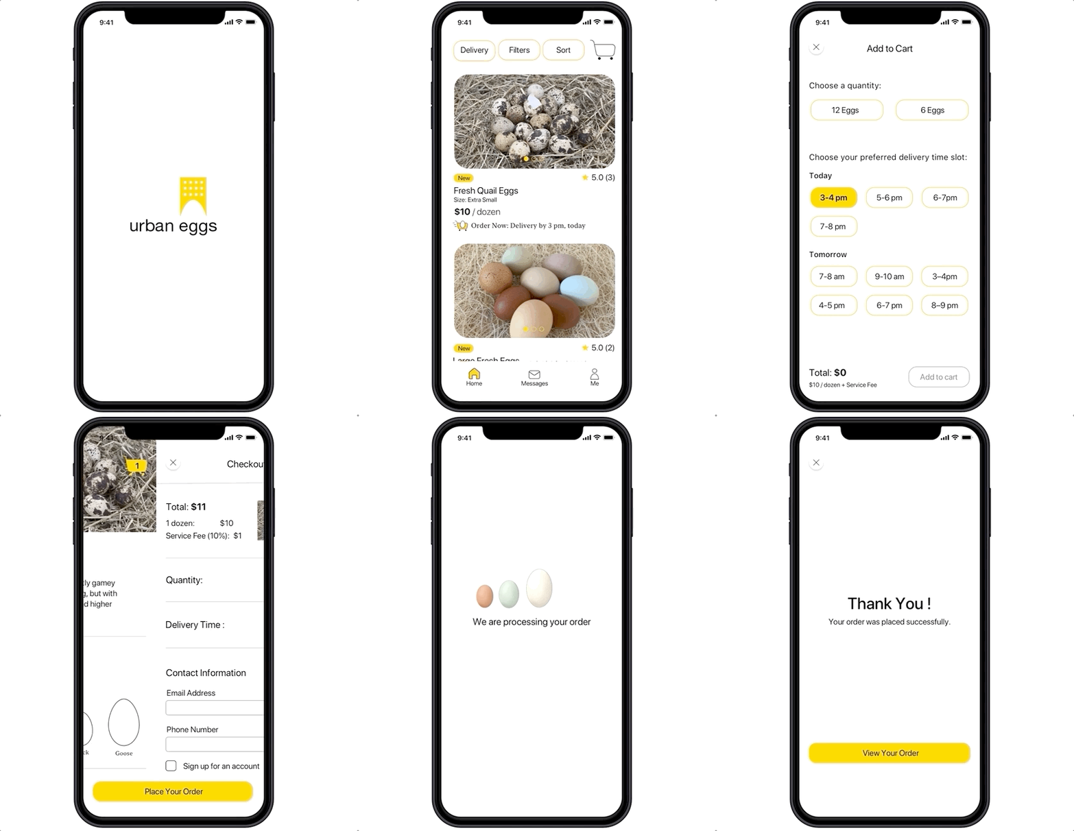
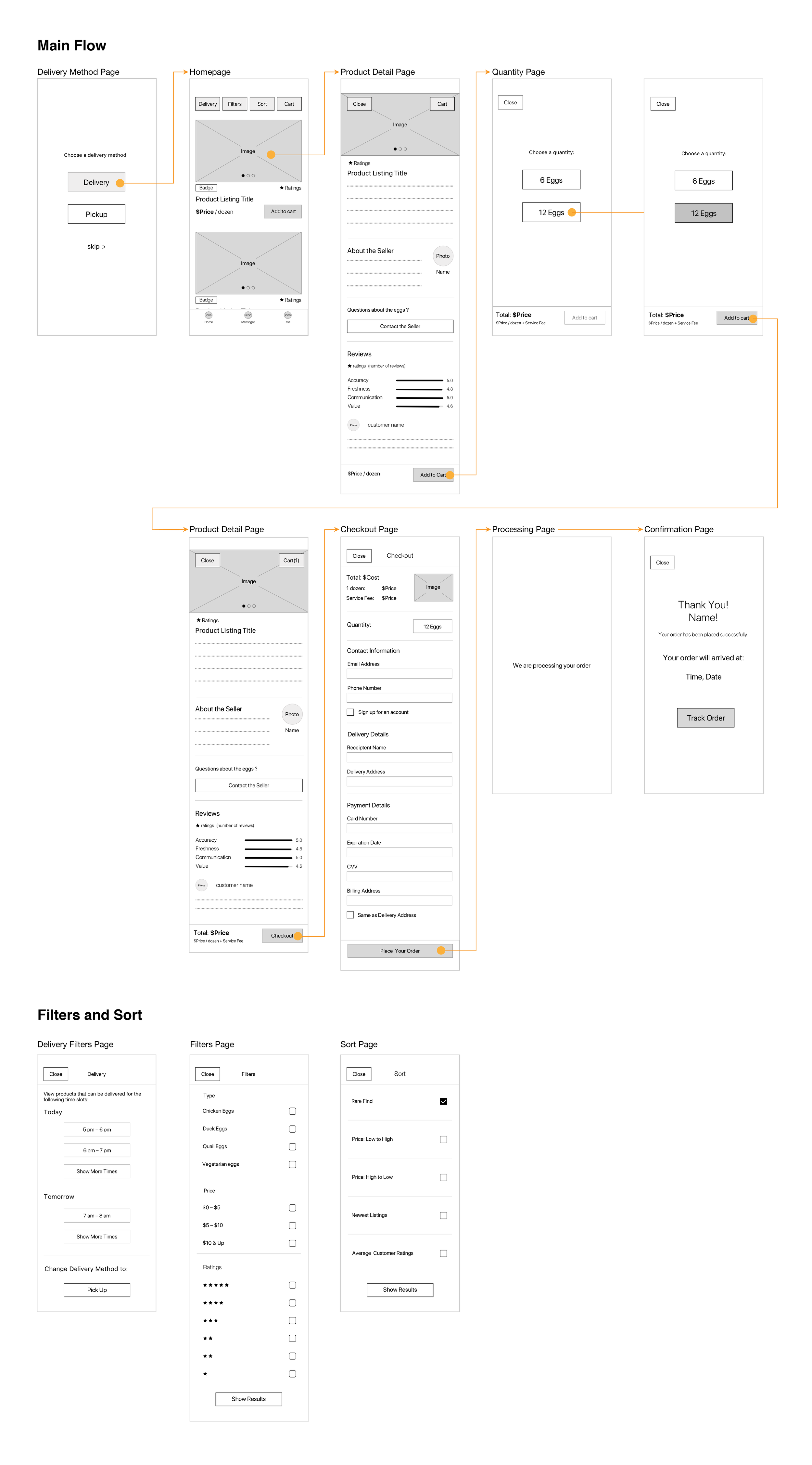
Wireframes – Using the research insights as a design direction, I build the wireframes which include the following functionalities:
Choosing delivery time slot prior to checkout
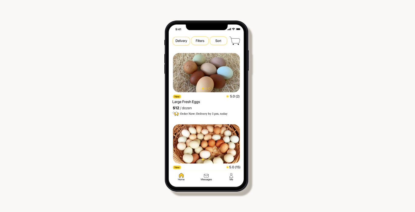
Filtering and sorting products based on user preferences
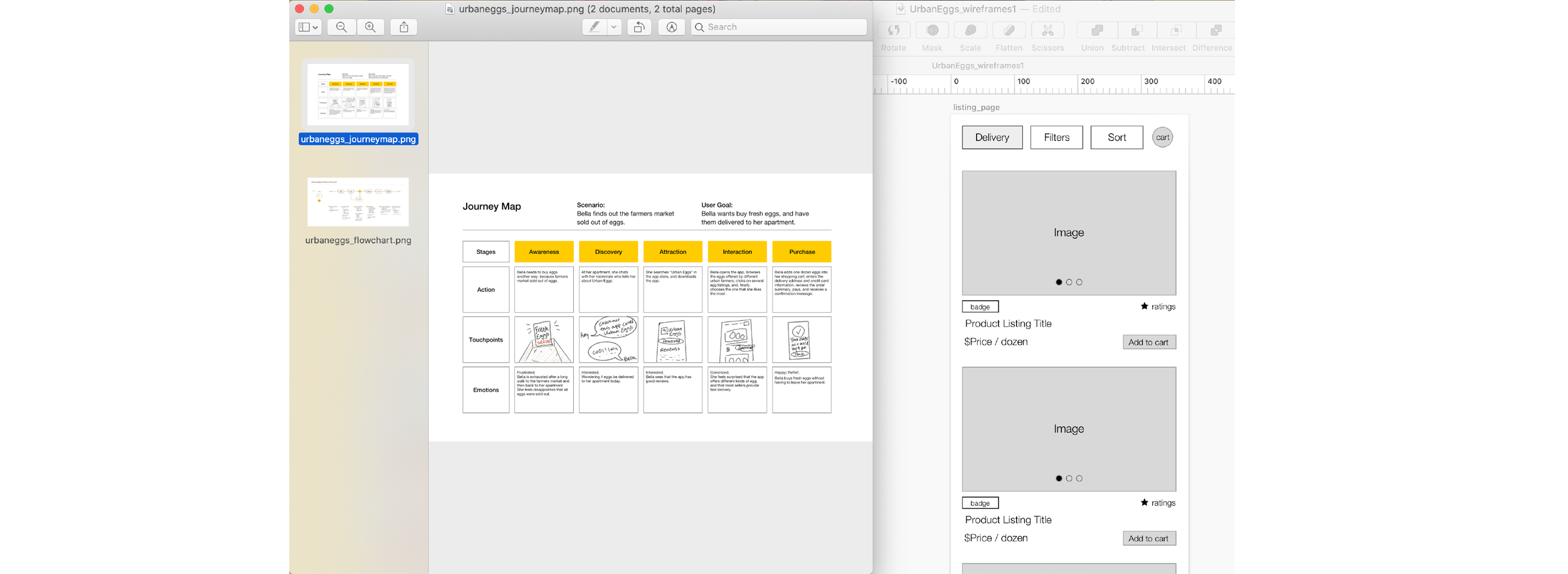
Using the journey map and the flowchart to guide designing the wireframes
EVALUATE
Usability Testing – I tested the wireframes with 3 participants, and asked them to do the following tasks:
A homepage tour: what do you see? what do you think you can do with the app?
Buy a dozen eggs for delivery to your home.
Key Takeaways:
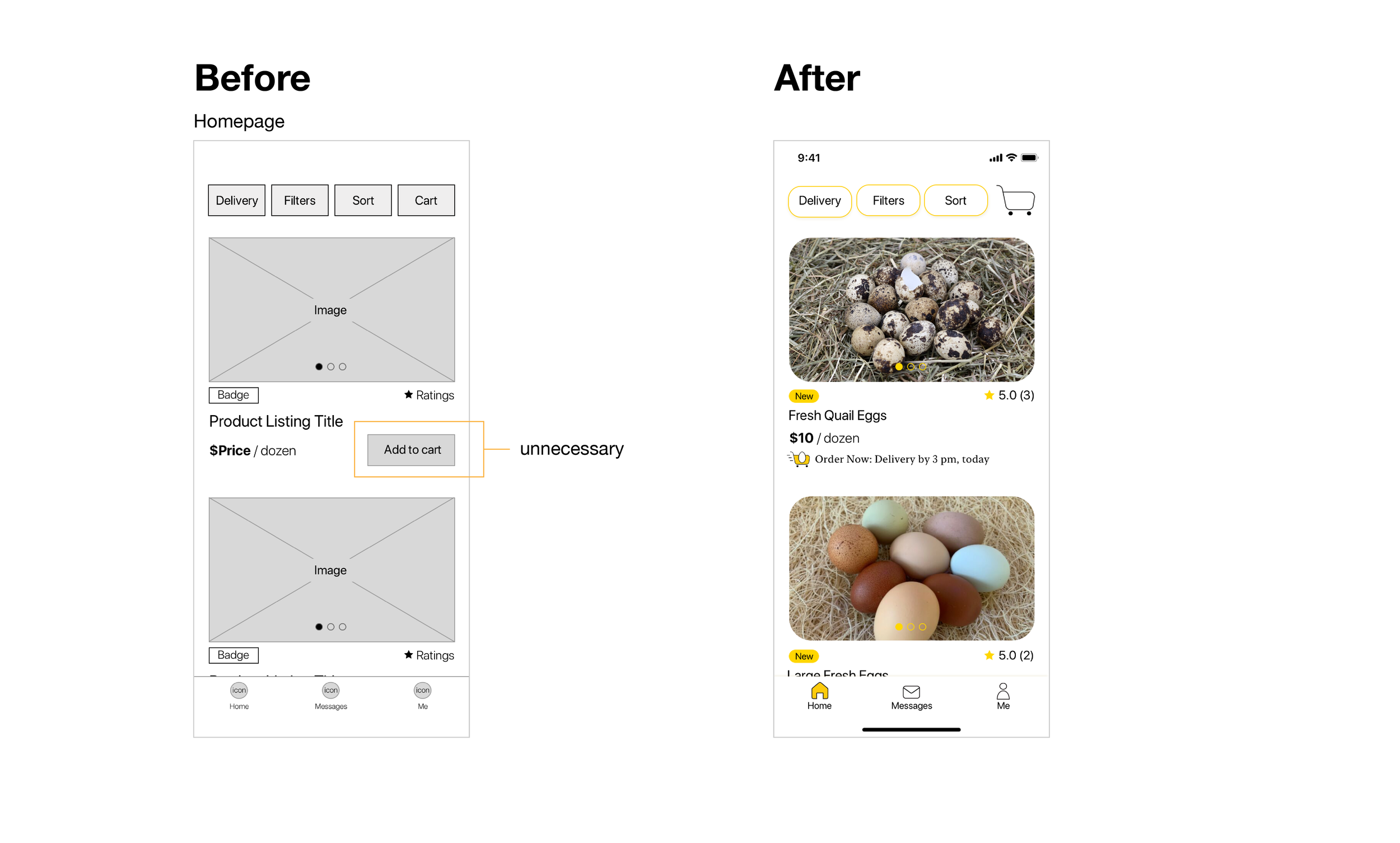
Participants are not likely to add a product to the cart before reading the product details
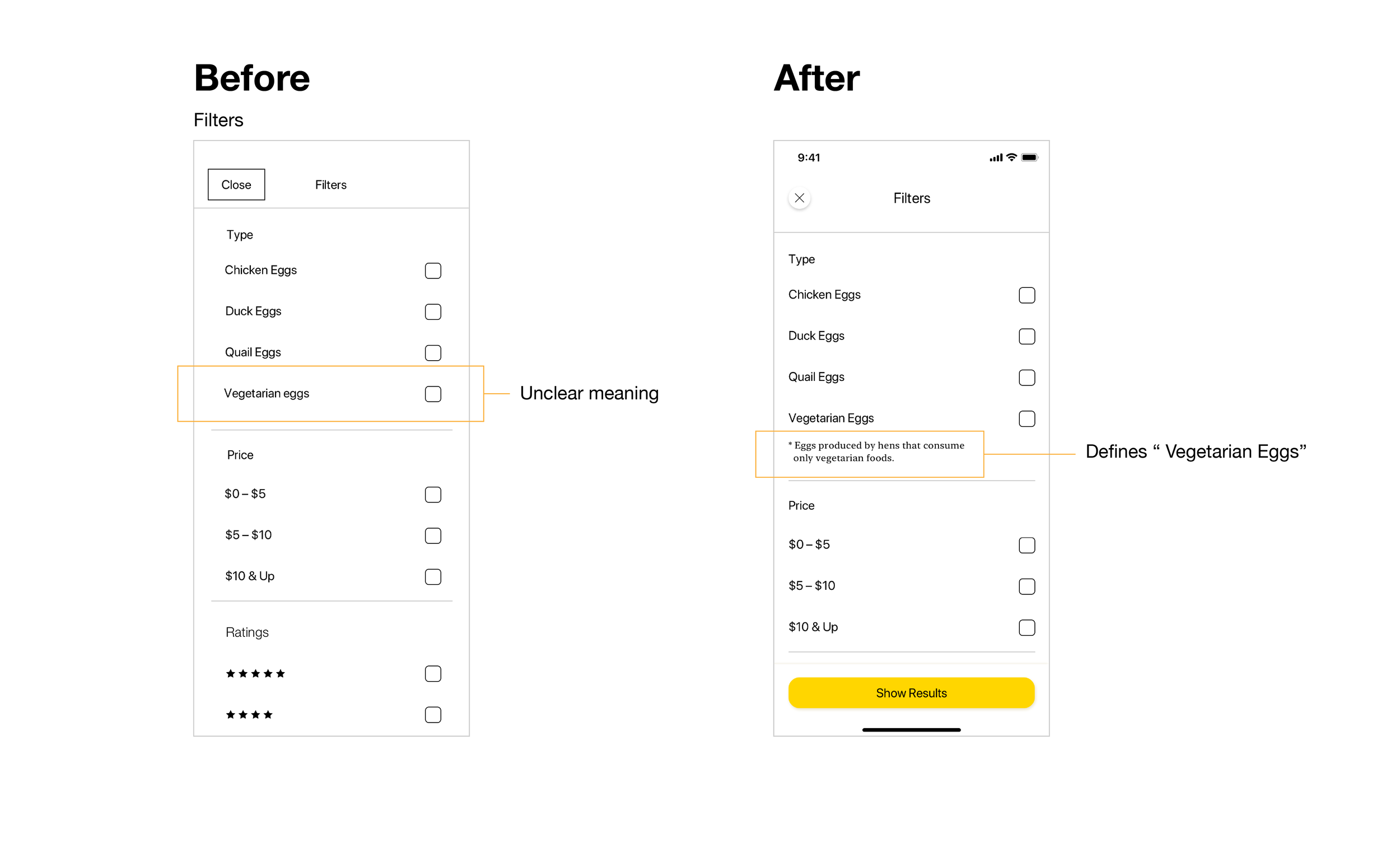
The meaning of “ Vegetarian Eggs” is ambiguous
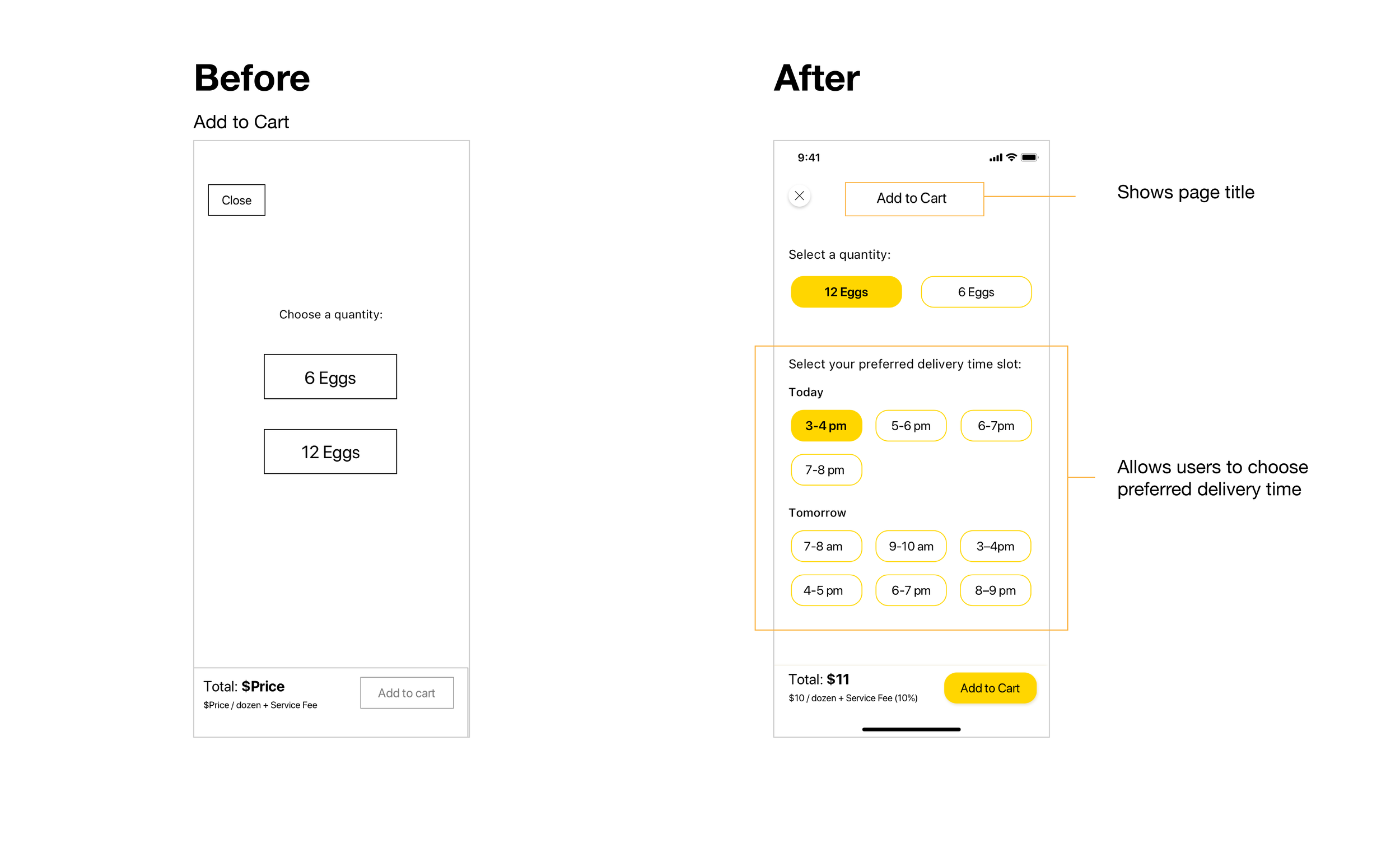
The product-detail page did not allow users to choose delivery time
Iterations
UPDATE
Clickable Prototype
Visual Design
